web app · frontend · user flows · user interface · prototyping · responsive
After creating ad hoc learning solutions for 30 years, TinQwise decided to launch their own Learning Experience Platform (LXP). This LXP was to be sold off the shelf, which is why it had to be flexible and solve most of the L&D problems that we’d encountered over the years. With a launching customer in early 2020, LXP is now used by 120 companies from different industries.
LXP consists of a learner-facing web-app, an admin environment called Control, and a content builder to create learning content.
For the first 1,5 years I built new features, styled the platform for clients and fixed bugs as a front-ender. This role became more ‘hybrid’ as I started taking on design tasks. The UI was getting messy without a designer in the team so I created more structure with a design system. After this I cleaned up existing features and started designing new ones.
As the single designer on the team I now also host client workshops to learn about their problems and needs. I validate my designs with stakeholders and provide input for the product roadmap.

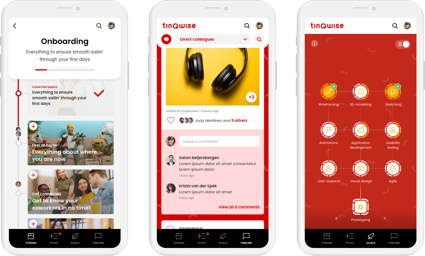
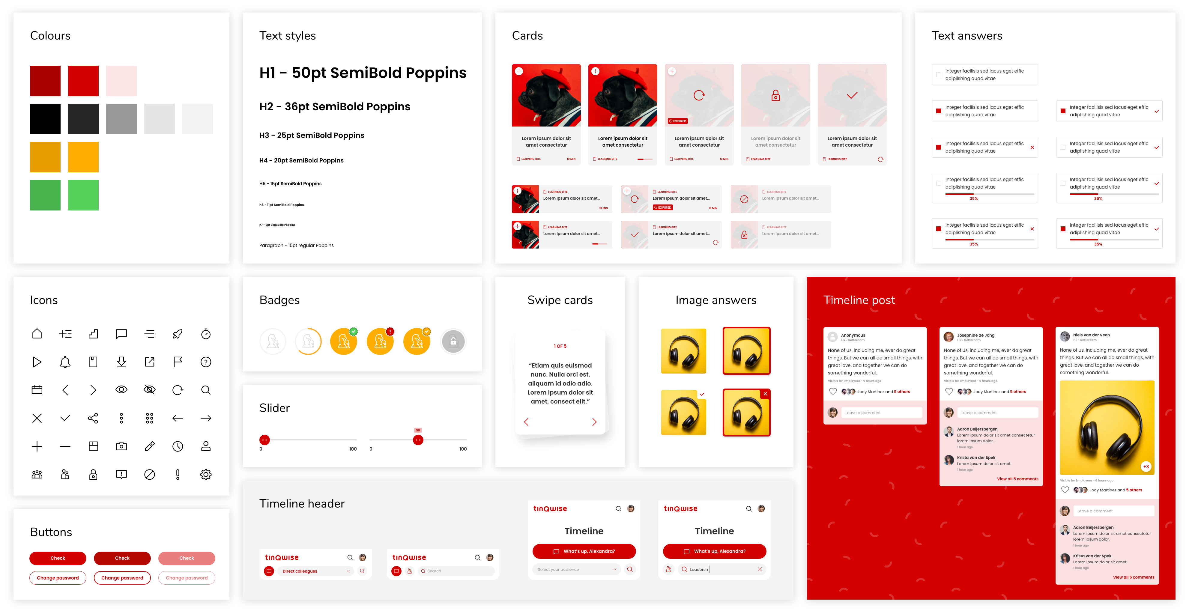
The first designs for the web-app were made by an external agency who were only involved in the early stages of the platform. These designs were mobile only and consisted of about fifty screens. I translated the designs into a design system, filling all the gaps and making the components responsive. Over the course of three years, I have been refining and expanding this design system while simultaneously working on the development of new features.
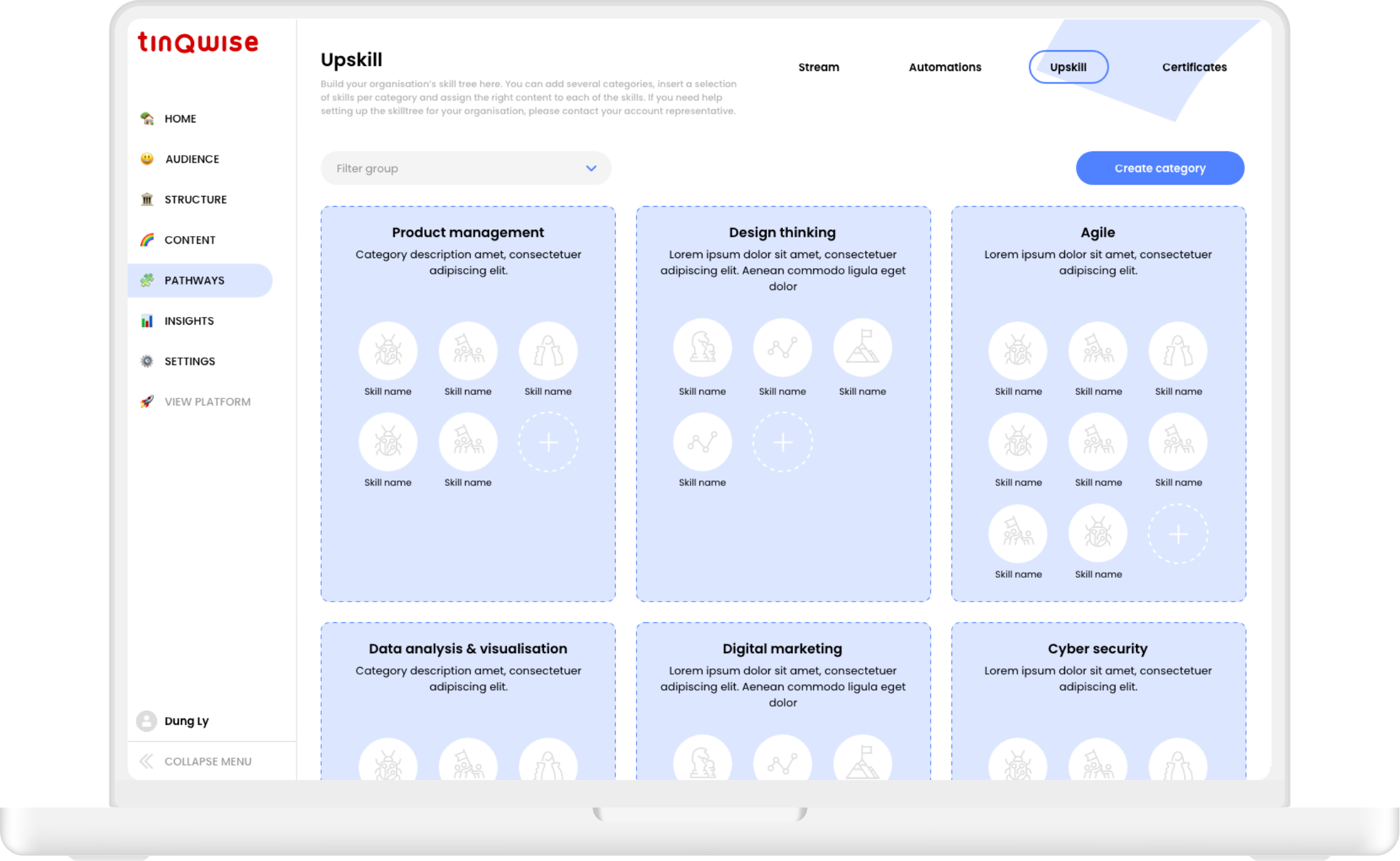
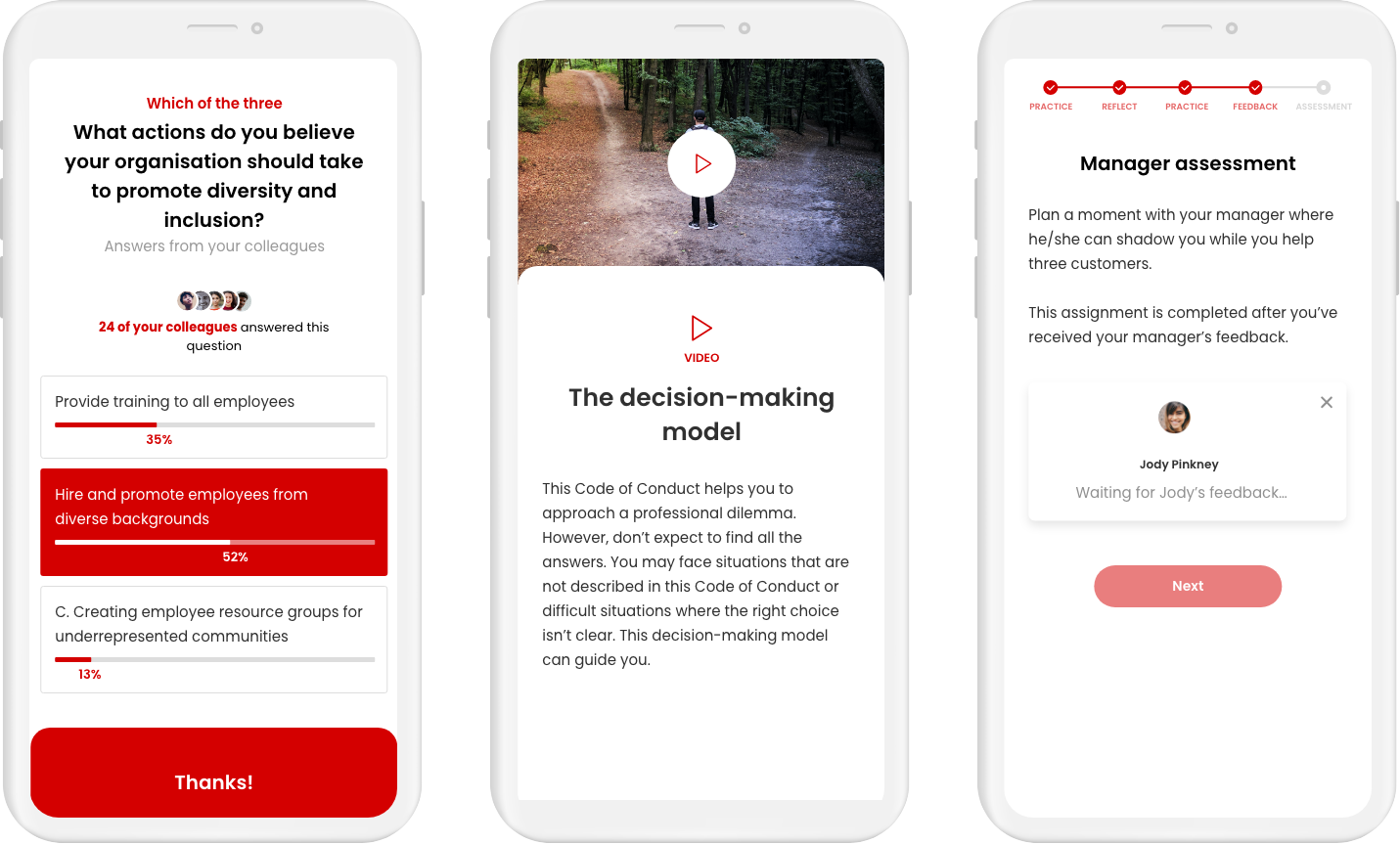
In the learner-facing app users can browse activities in the discovery stream, achieve badges for the purpose of upskilling and reskilling, save actions in their to do list and connect with their peers in the social timeline.
These features are all built around learning activities such as interactive learning bites, assignments, tasks, offline or online trainings called ‘sessions’, videos and podcasts, social challenges, quizzes and exams.

The challenge with the LXP design system was that the components had to be skinnable for our client organisations and brands. In the early stages of LXP all styling was done ‘by hand’ by one of the front-enders (including myself). Later we implemented a styling wizard in Control so client admins could style the platform themselves. We developed a base theme that we could easily inject with variables, such as colours, fonts, and border radius without losing contrast or creating weird colour combinations in the UI.
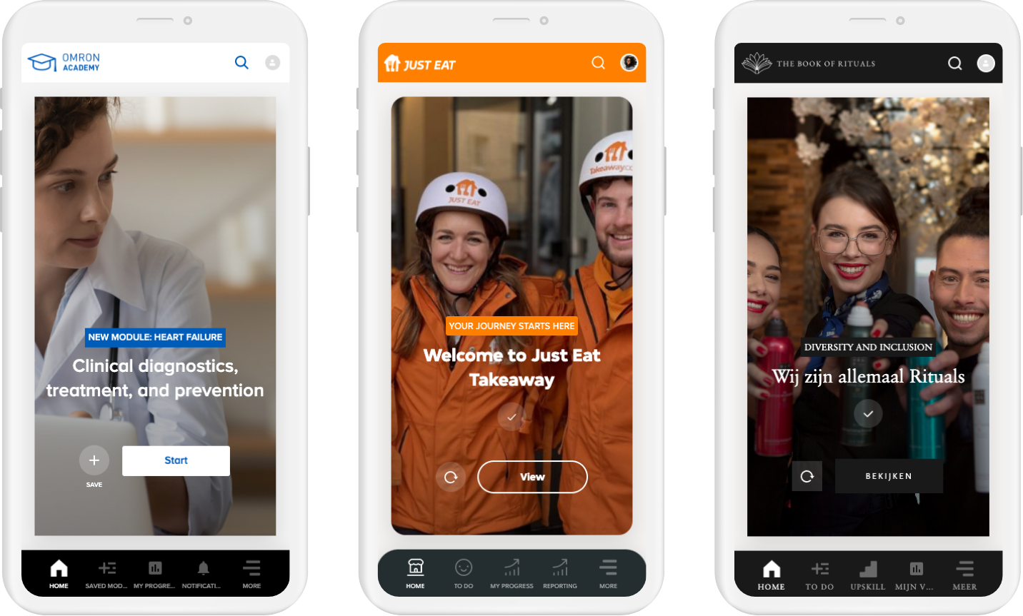
The ‘billboard’ widget in three different skins
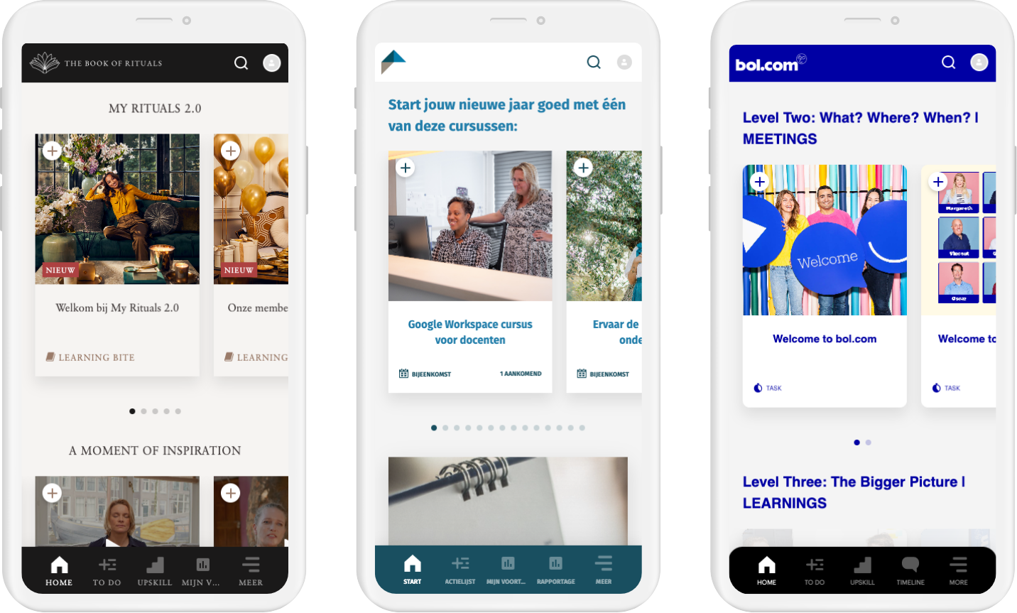
The ‘suggested activities' widget in three different skins
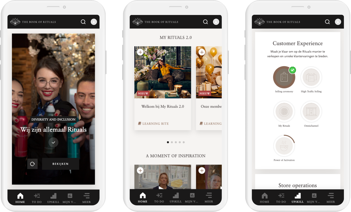
The Rituals LXP platform
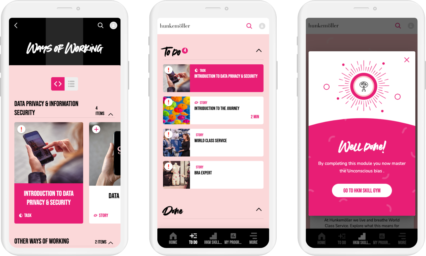
The Hunkemöller LXP platform
Initial development of the Control (admin) environment was incredibly messy. For the first 6-9 months the dev team basically improvised the whole UI. They combined a handful of old designs and existing components with their own developer logic to create new features. This was until I created a separate design system for the Control environment and started cleaning up all the features.
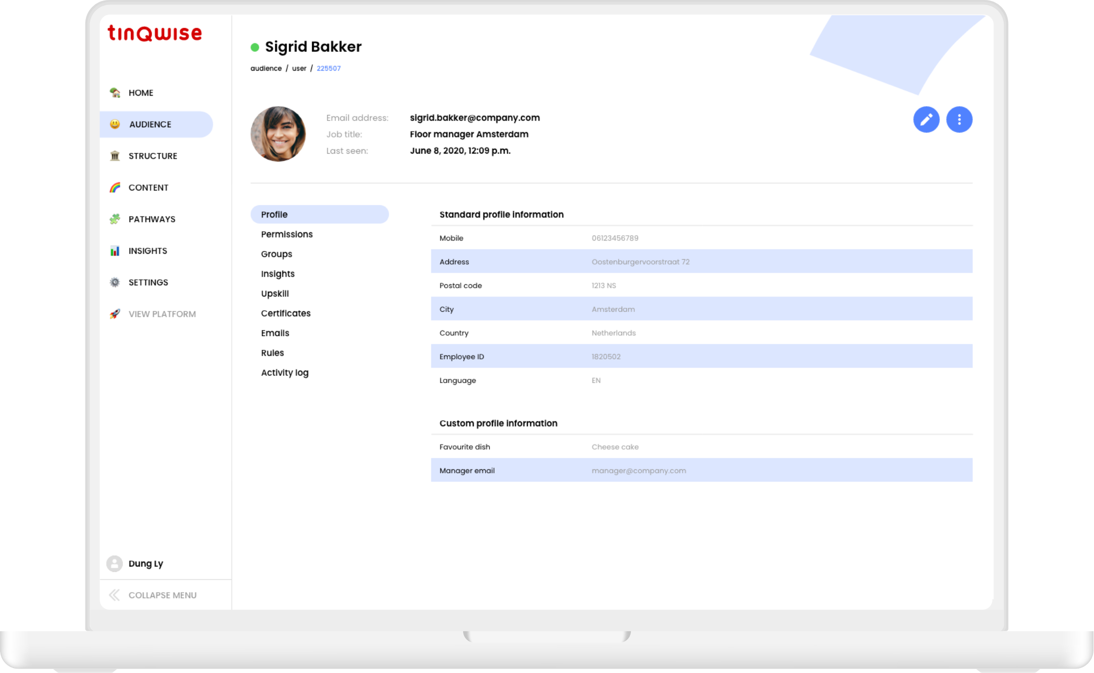
Control needed a different design system from LXP because it targets admins instead of learners and is used on desktop only. It is not skinnable and displays a lot more information than the learner-facing web-app. For this reason the text styles are smaller and we use other components such as form elements and tables.
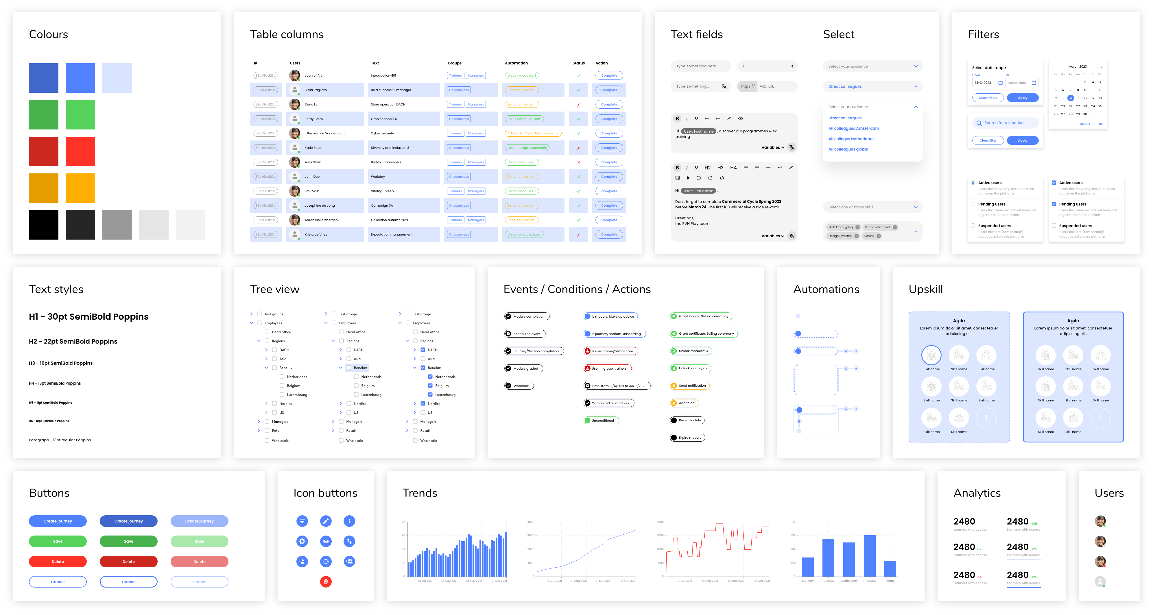
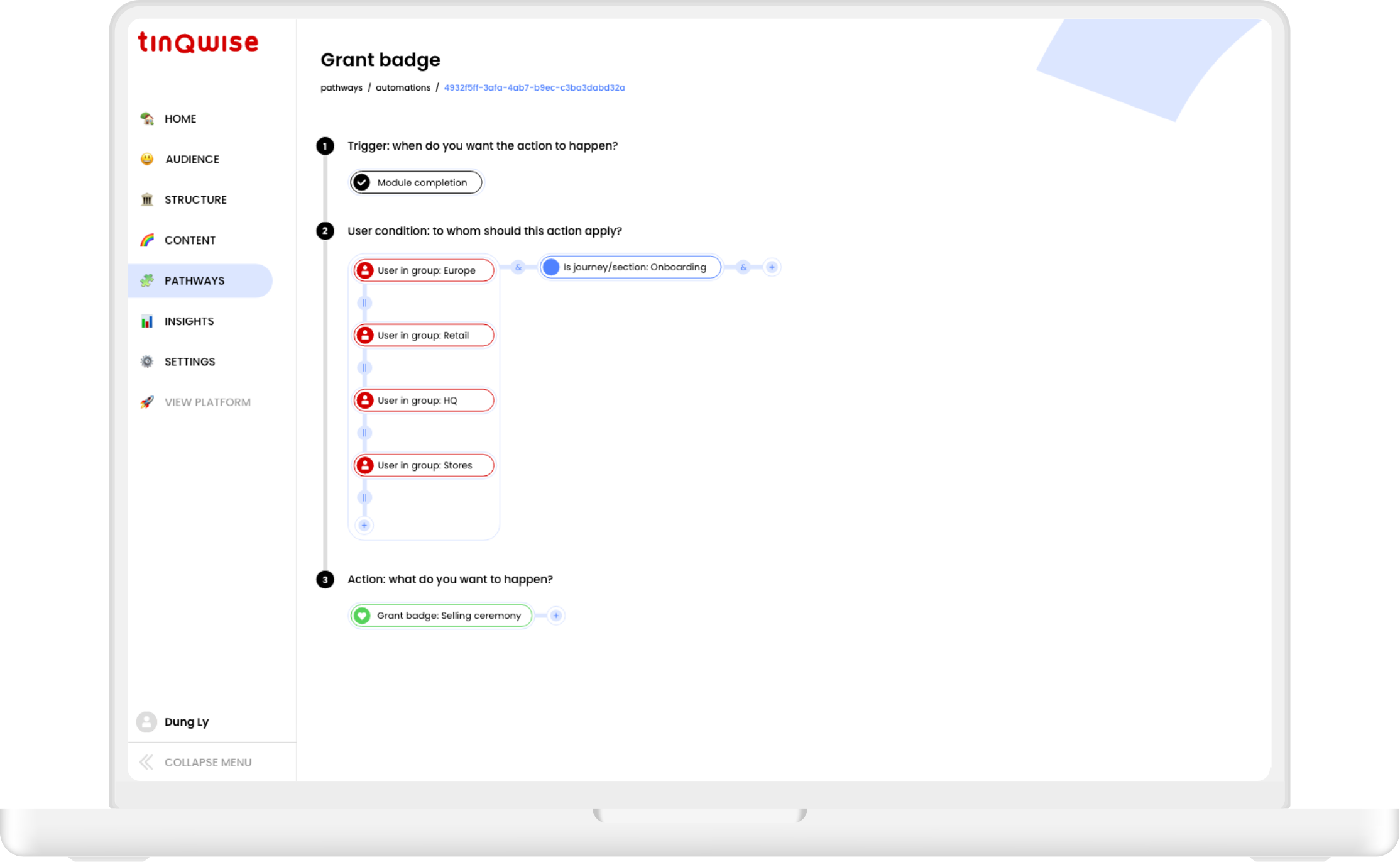
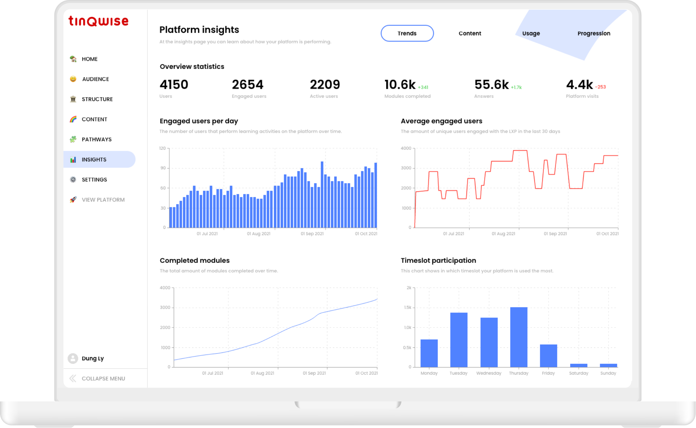
In the Control environment admins have to perform tasks such as user and group management, creating and managing content and configuring platform behaviour. They can also monitor trends and see how their learners are performing.
When designing a new feature I always need to design for the learner-facing web-app but also for 'the admin side of things'. It's admins who determine which widgets are visible for their learners in the Discovery Stream, which badges they can earn, which groups they can communicate with in their social timeline and what kind of notifications they receive.
