web app · branding · user flows · user interface · prototyping
Every month, an average of around 25 new employees start working at Stedin; a large power grid operator in the Netherlands. During their onboarding these new hires - spanning form technicians to managers - undergo a complete immersion into the Stedin culture. TinQwise was asked to develop an onboarding platform that guides Stedin’s new hires through their first 100 days.
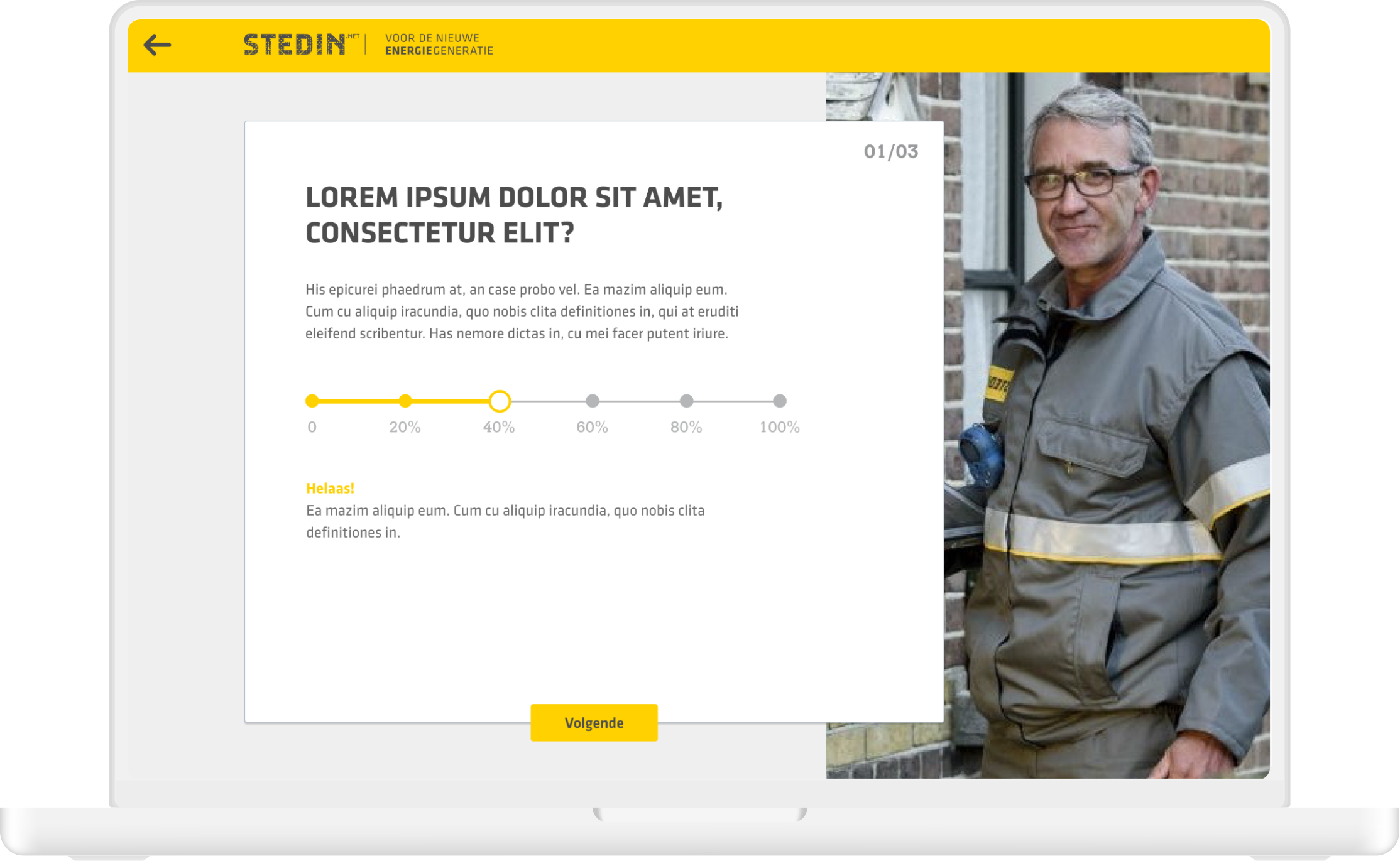
As the only designer on this project I created everything from user flows and wireframes to the final UI designs and specs for the developers. Also, the company had recently moved towards a more sustainable strategy, mission and branding which was not yet shown elsewhere but had to be reflected in the platform.

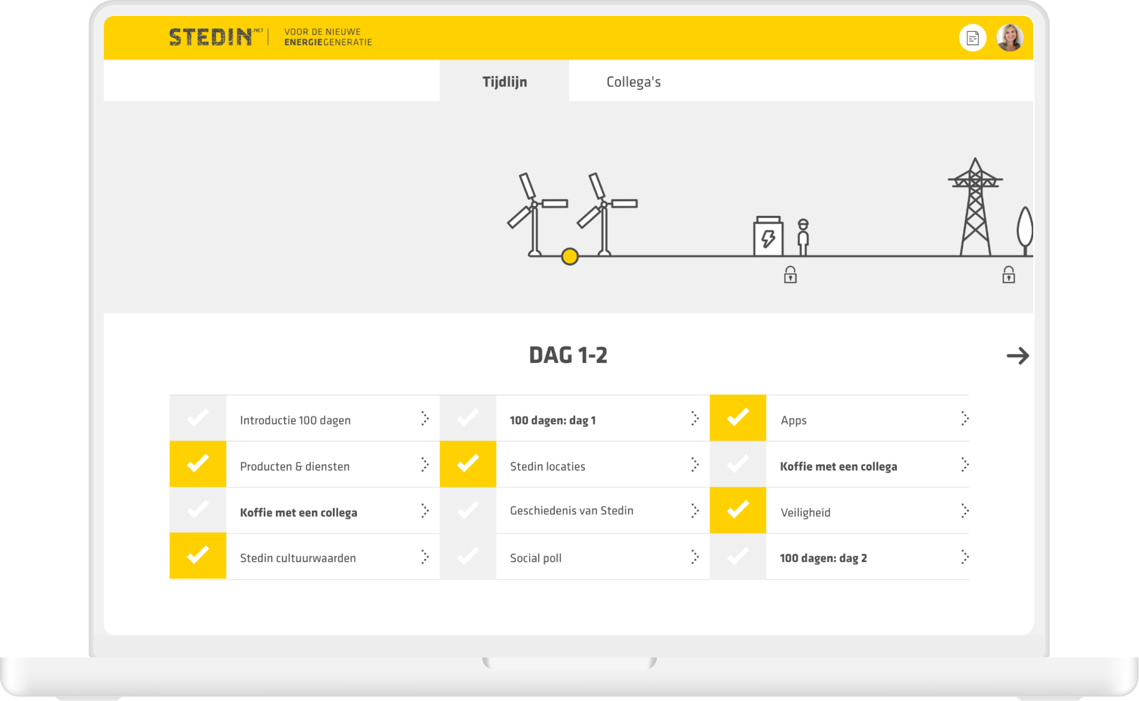
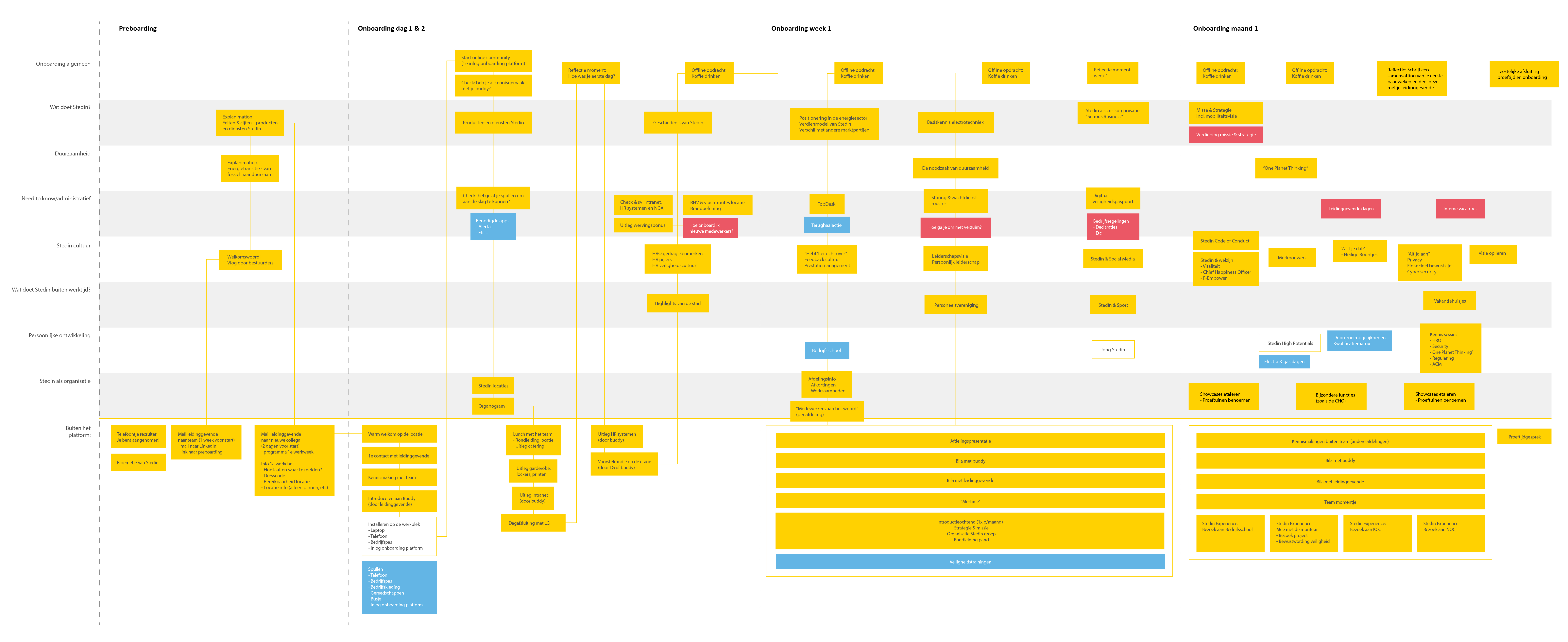
We first created and inventory of all the onboarding activities that Stedin already had (or wished to have) during this 100-day period. These were categorised across different topics, including online and offline activities and then plotted onto a timeline. Towards the end of the onboarding the density of activities was reduced as new hires would get used to their new role and would experience an increase in their day to day tasks and responsibilities.
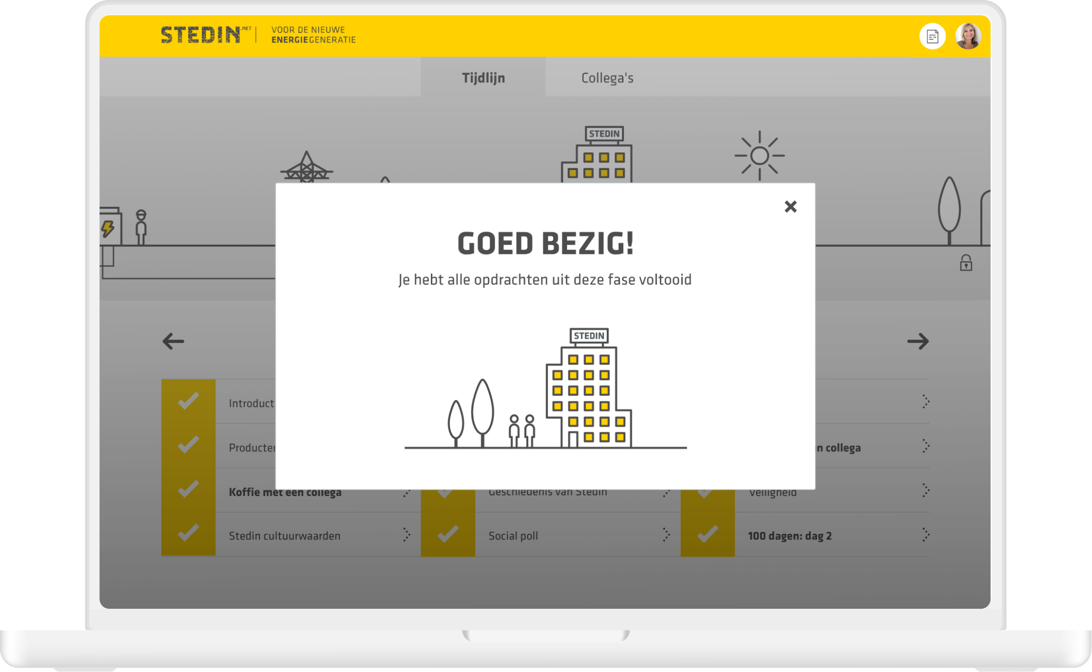
After the content mapping I created a visual representation of Stedin’s onboarding journey. As a new hire progressed through the timeline, they would see wind turbines, solar panels, utilities, the Stedin office and eventually their home being connected to the grid.

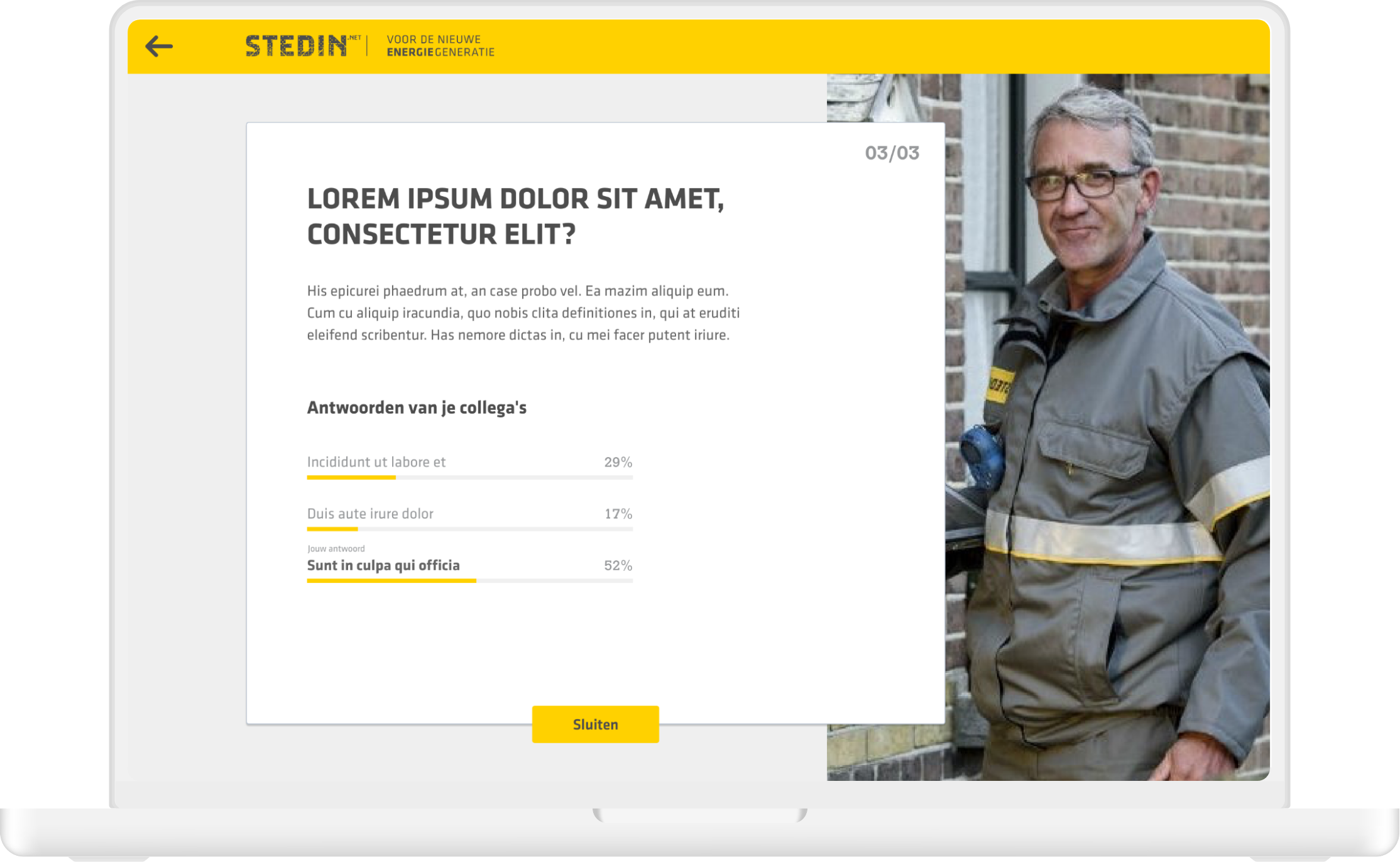
New employees see the company through fresh eyes. So they were given a 100-day assignment: take a critical look at Stedin as an organisation during your onboarding. What do you see? What does Stedin do well, and what can it do better? The input of various reflection moments were collected in a personal 'portfolio’.
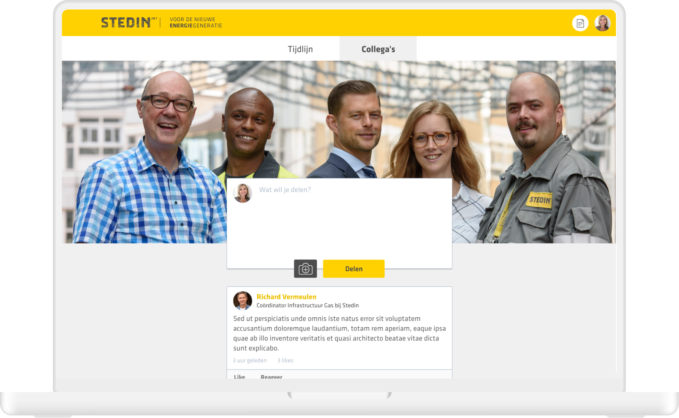
Once we discussed the desired features I proceeded with creating a user flow showing how the platform would be organised. Apart from the onboarding journey and portfolio, the platform was to include a walkthrough and intake, a user profile and social timeline.
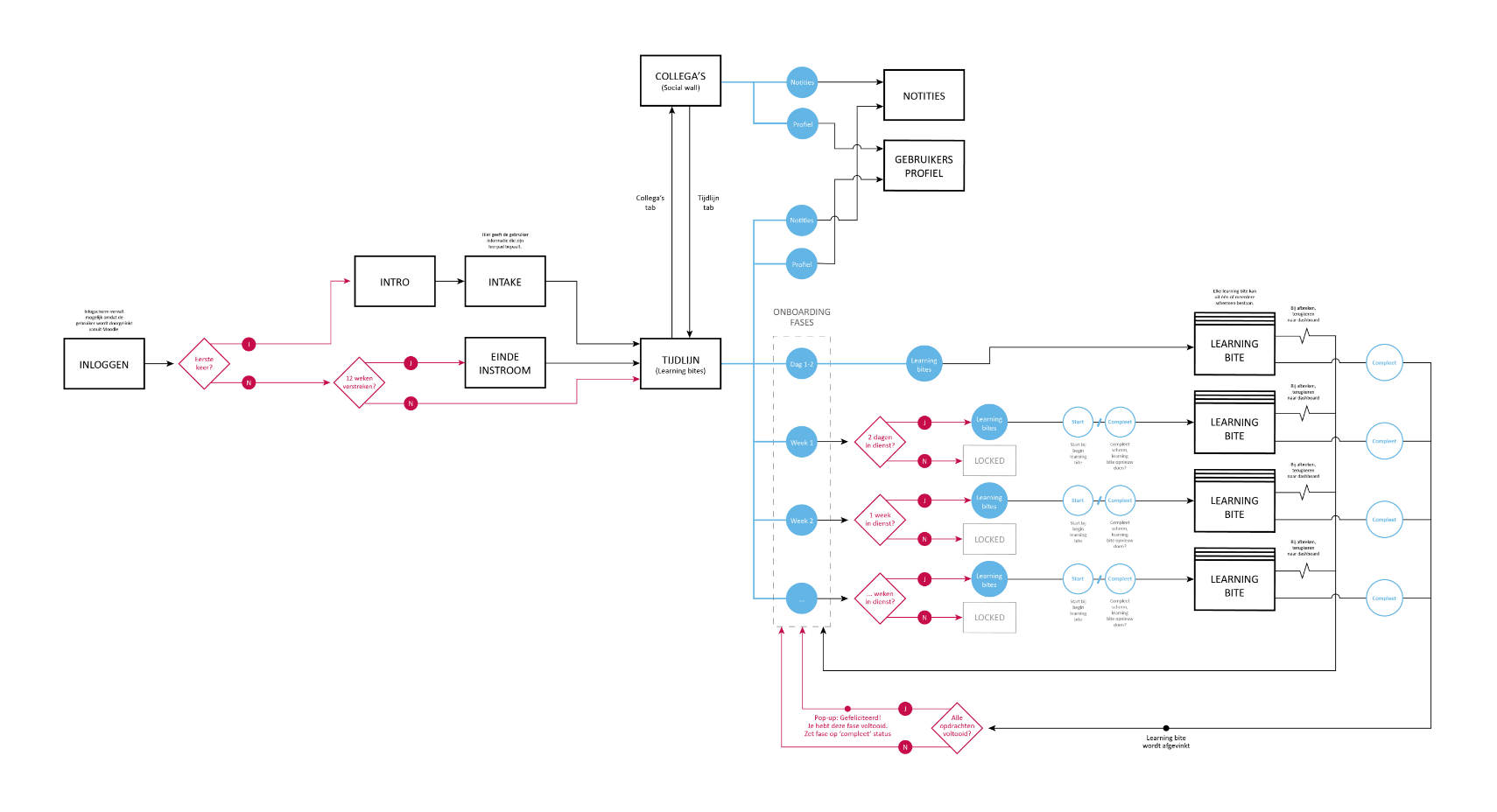
Once the user flow was approved I knew which screens were needed so I proceeded with wireframes and designed the final user interface.
