web app · responsive · user flows · user interface · wireframes · prototyping
IKEA has one of the most iconic shopping experiences of all retailers. A great part of this experience is that there is much to touch, see, and feel and that you are able to try out almost every product in store. When done effectively, IKEA’s merchandising principles greatly increase sales.
This is why TinQwise developed an app that lets IKEA employees step into the shoes of their own customers and do ‘Test Buys’. The goal was to let employees find mistakes and inconsistencies in their products on display, while at the same time learning about the principles of commercial merchandising.
This idea was first pitched to IKEA and due to my limited capacity at the time an external agency was hired to do the high level concept. Once we landed the project I took over all the design work. As app development goes, new insights caused the concept to change multiple times along the way. I turned the concept sketches into a robust design, closed all the open ends and created everything from user flows and wireframes to the final responsive UI designs.

Before developing the app, IKEA already had a Test Buy process in place. Amazingly, it consisted of an Excel sheet listing the steps and a paper form to report mistakes. The steps were not straightforward at all and the instructions were filled with jargon, making it confusing for employees. Furthermore, the process assumed that employees already had a certain level of knowledge about commercial merchandising, which was not the case.
The app was a typical example of “performance support” since it allowed employees to look up theoretical information during Test Buys. This approach assisted IKEA employees in recognising and solving mistakes while learning on the job.
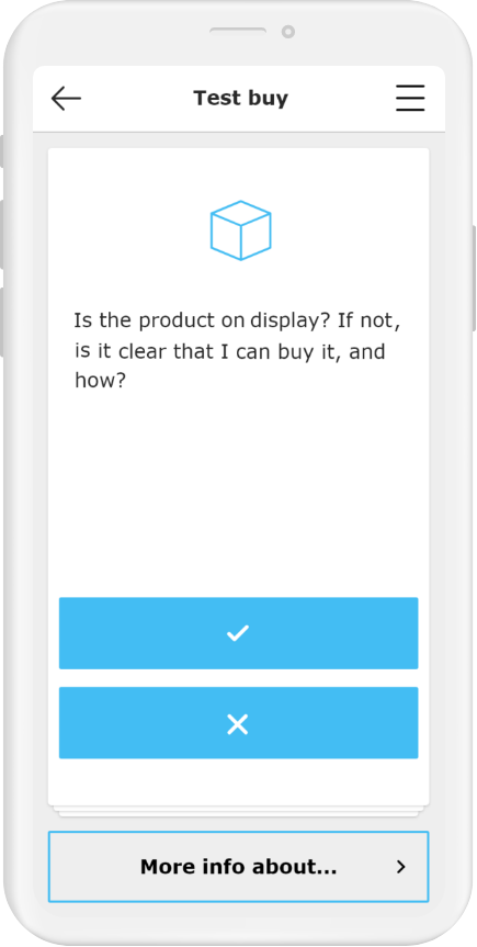
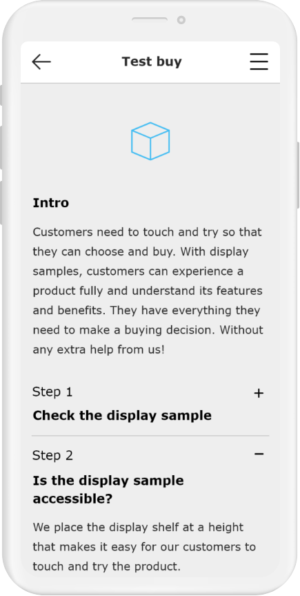
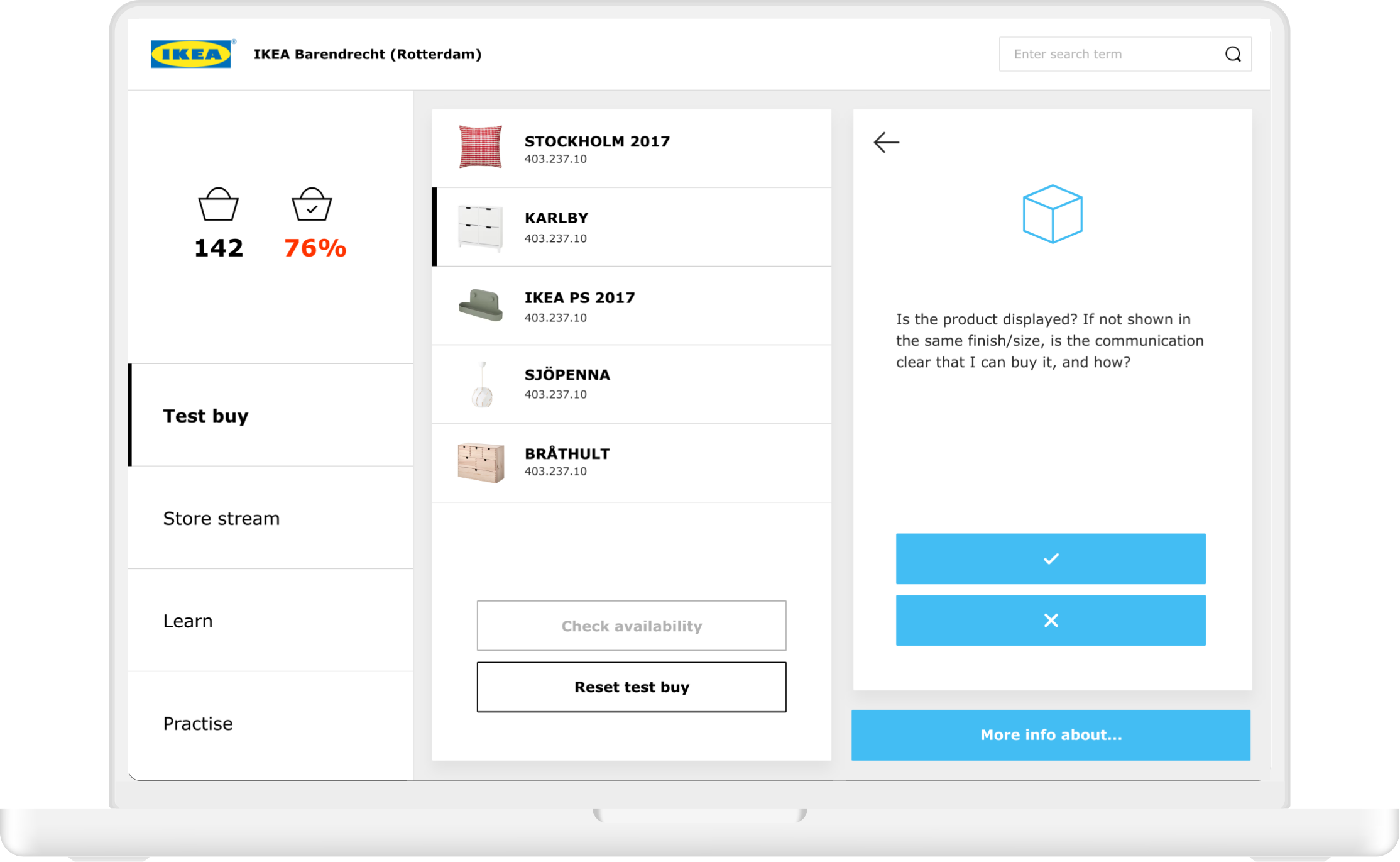
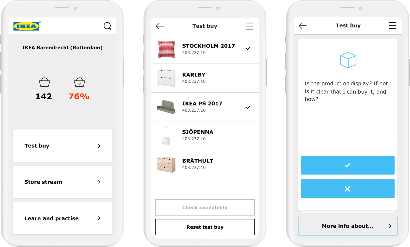
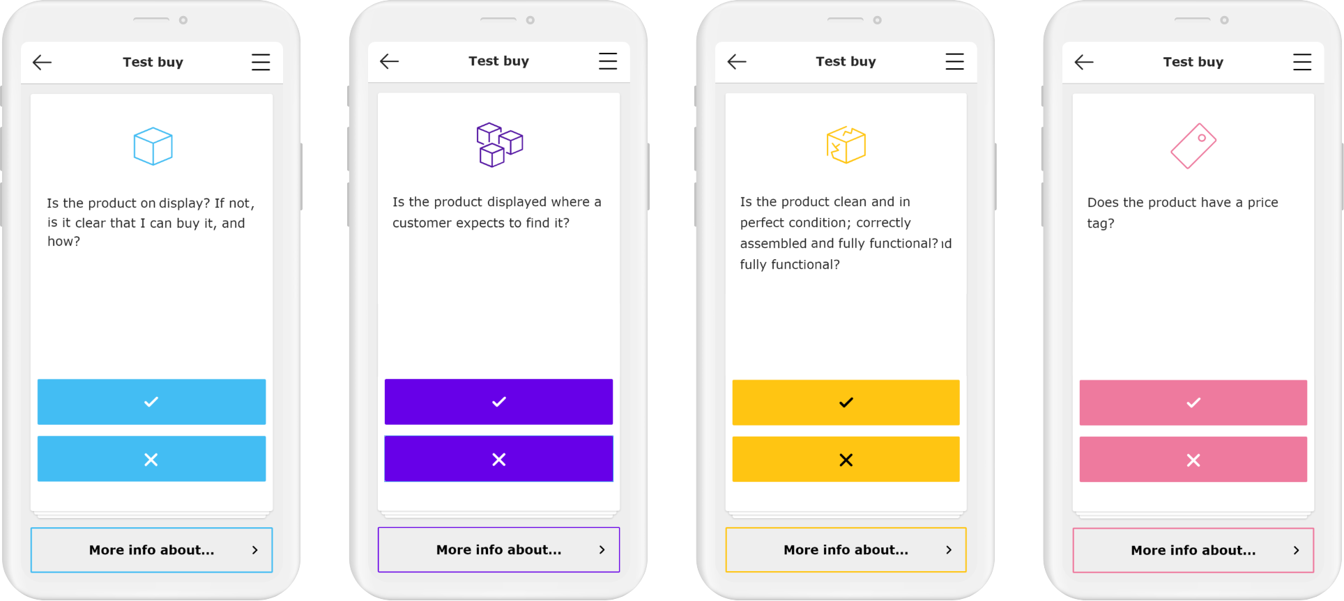
I created the Test Buy flow using the Excel sheet as input. The employees were first given a ‘shopping list’ of IKEA products to find in their store. They then had to follow seven steps, answering questions such as ‘Is the product displayed where customers expect to find it?’, ‘Is the product clean and in perfect condition’ and ‘Does the product have a price tag providing the correct info?’. When in doubt, they could consult a ‘more info’ button to read more about the specific subject.
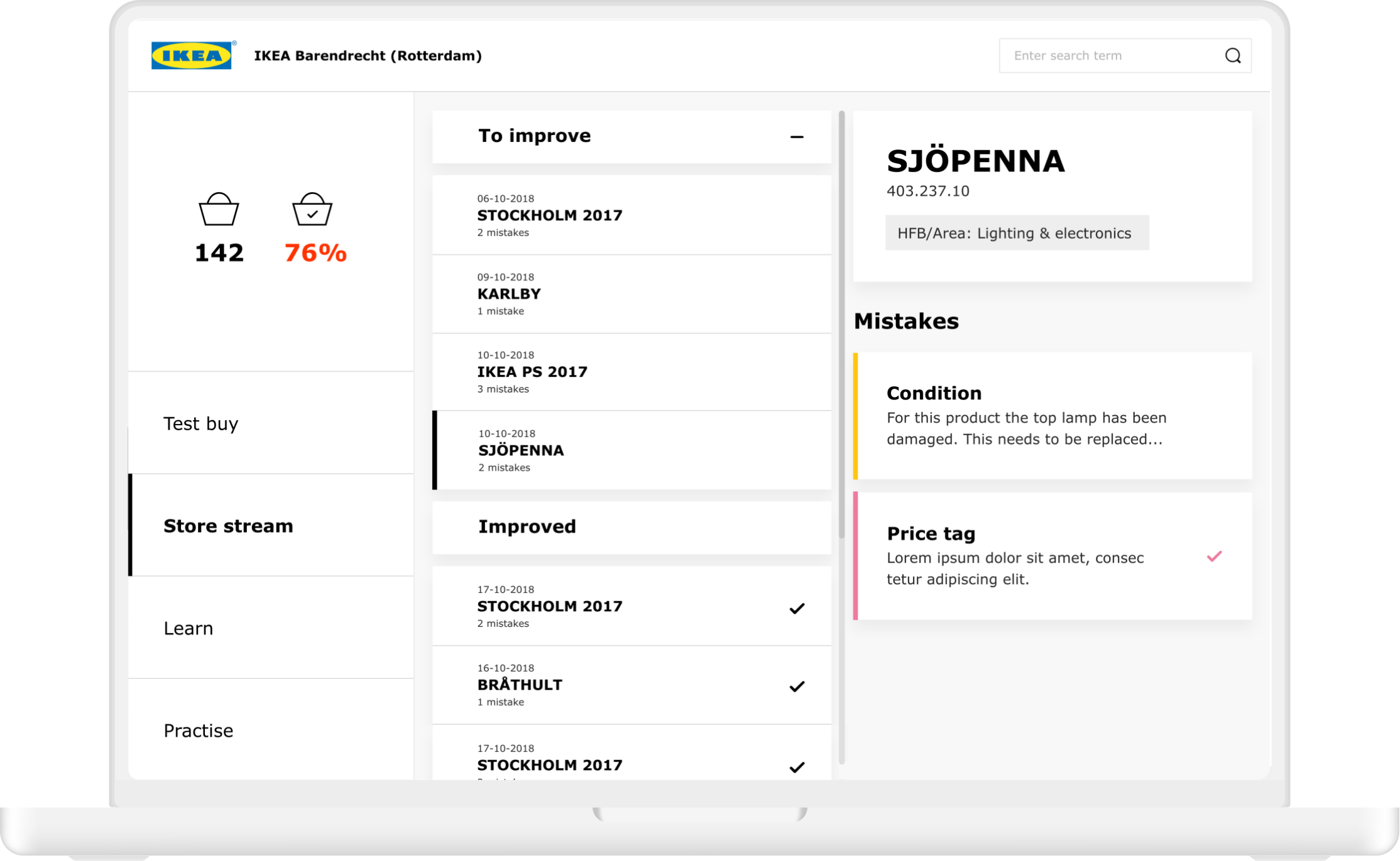
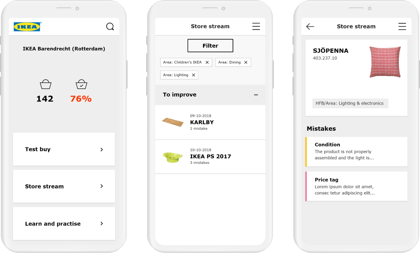
When an employee identified a mistake, they needed to either fix them (if it could be done in less than one minute) or report them. The reported mistakes were then collected in the ‘Store Stream’ to be fixed at a later time.
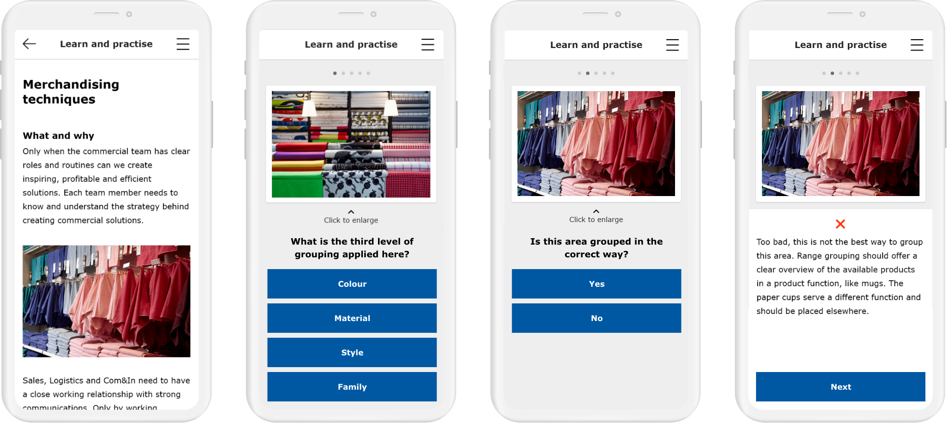
A separate part of the app was dedicated to commercial merchandising theory. In ‘Practise’ and ‘Learn’ employees could get a complete overview of IKEA’s merchandising principles, watch ‘how to’ videos and test their knowledge.

After defining the flow I explored the Test Buy in more detail on a screen-by-screen level by creating wireframes.
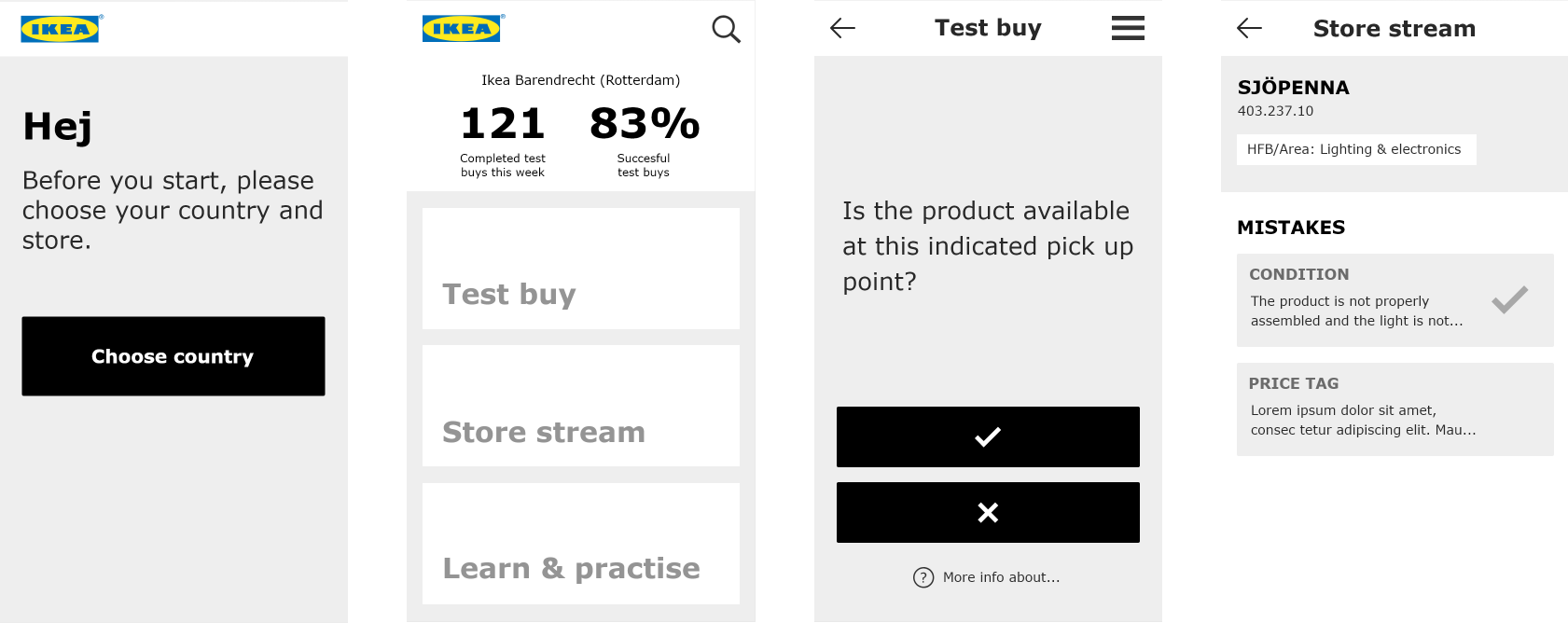
Once the wireframes were approved I designed the final user interface based on IKEA branding.
