web app · branding · user interface · prototyping
For fastest growing global lingerie brand Hunkemöller, TinQwise created an onboarding programme and academy that still exists to this day. During a long lasting partnership of over 8 years, these platforms were redesigned, migrated and iterated upon many times.
Back when it went live, ‘Live it Up! was one of the most innovative online onboarding programme in 17 languages. Through this programme Hunkemöller onboarded no less than 22.000 new hires in two years’ time. After this powerful start, employees would gain access to Hunkemöller Academy. This platform was full of expert e-learning modules so that they continued to learn.
I was a new hire myself, so I was not involved in the first ‘Live it Up!’ and Hunkemöller Academy projects. These went live shortly after I started working for TinQwise. Even though the project won two gold awards at the Learning Technology Awards in 2017, it only took a few years before the designs were outdated.
The first platform was only designed for tablet and desktop. My task was to make the Academy responsive and to implement Hunkemöller’s new brand guidelines. In the end also the home screen needed an overhaul. First I only rebranded it and made it responsive but I ended up redesigning an entire new dashboard.
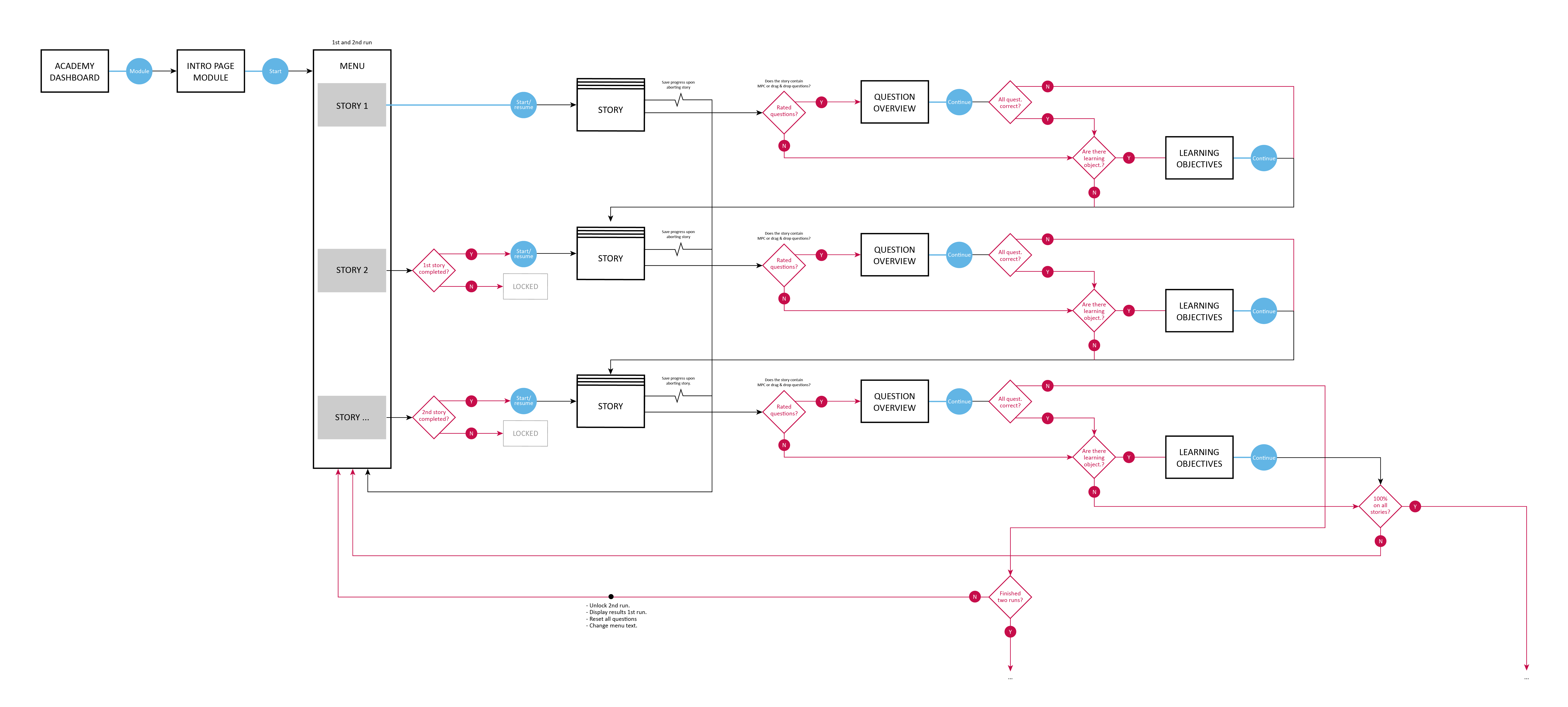
We migrated the Academy from Hunkemöller’s old Learning Management System to the TinQwise LMS and content builder. Hunkemöller had very specific requirements for their learning interventions. The behaviour was to be exactly the same after migration. No user flow existed for the old platform so I created one to make sure the dev team did not miss out on any logic.
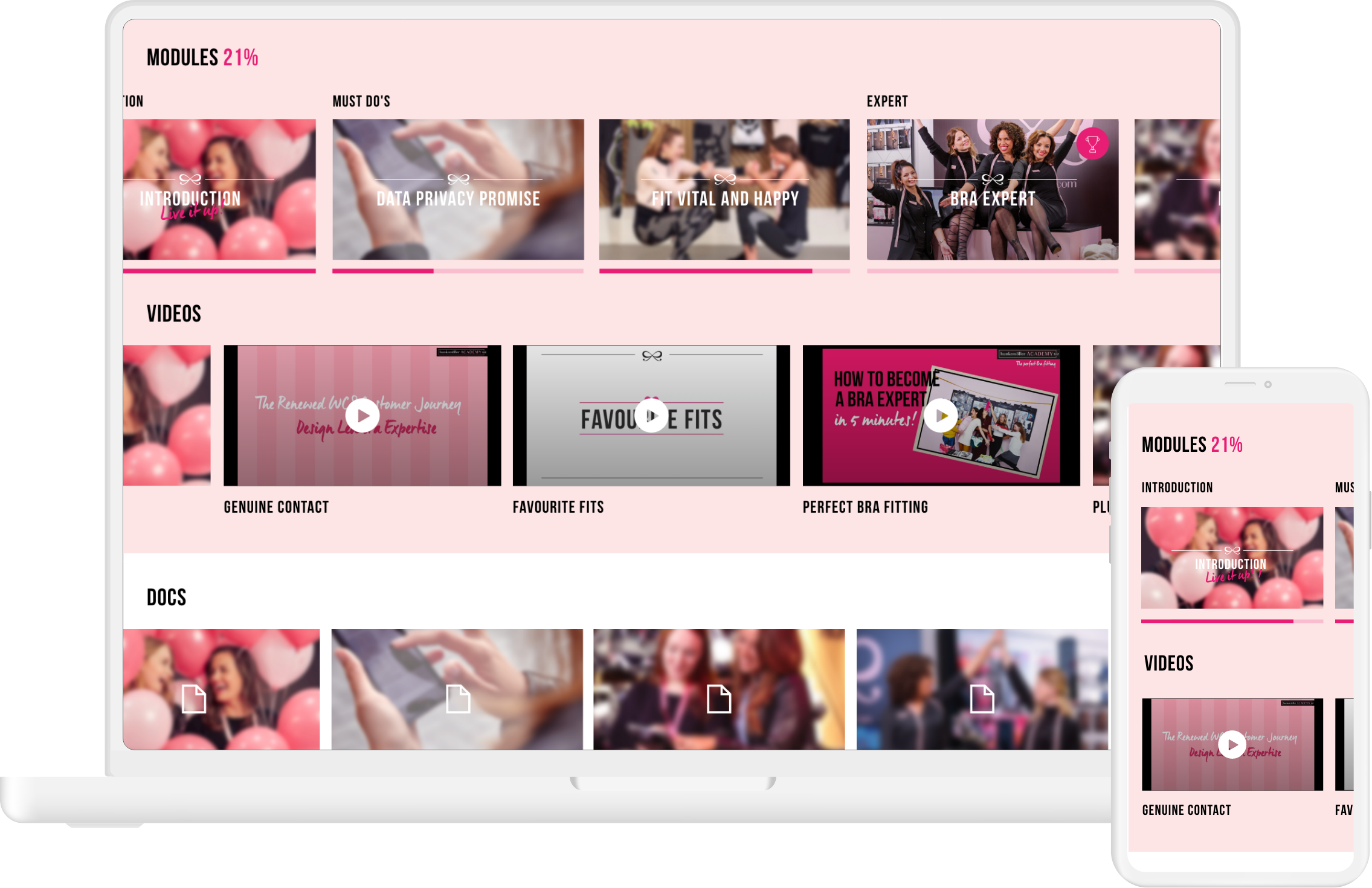
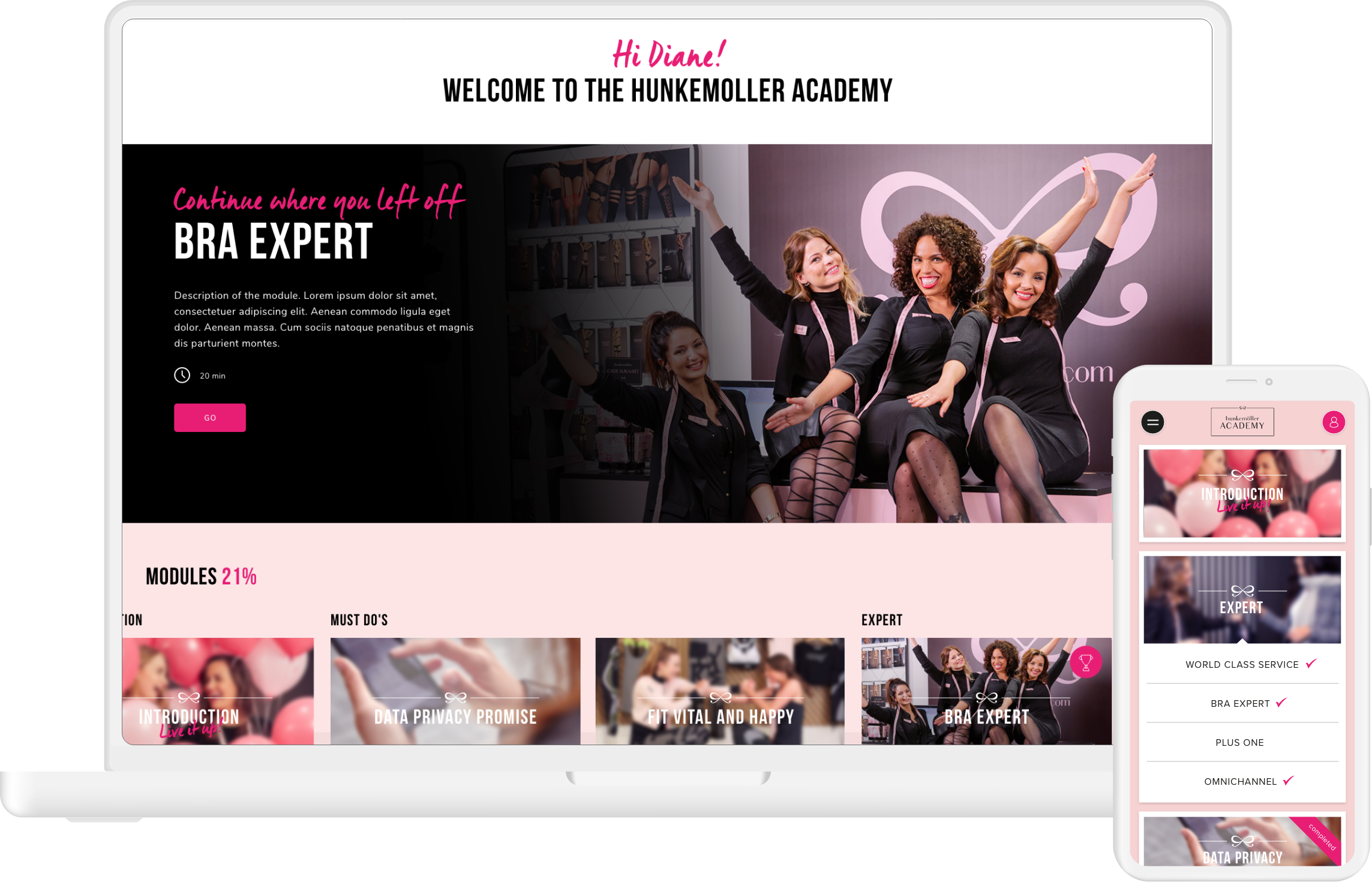
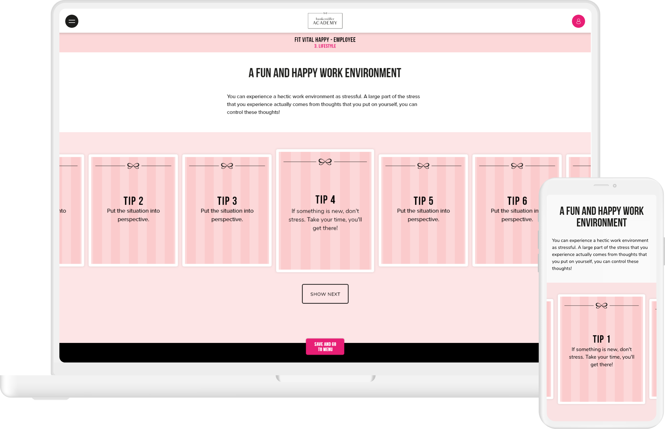
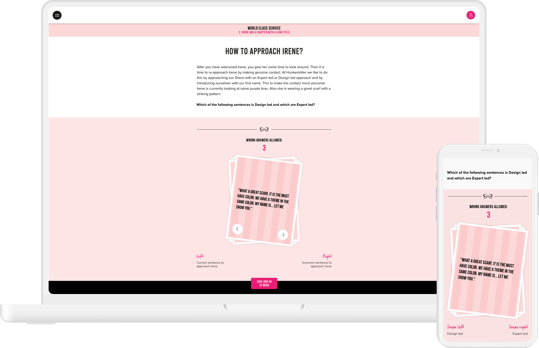
During migration I was asked to redesign all the screens according to their new branding and make them suitable for mobile. This included module learning interactions such as intro/outro screens and various instruction methods, but also the home screen, platform navigation, video library and rewards overview (‘wall of fame’).
Since the old designs were for tablet and desktop only, the amount of content per screen was very dense. I had to distribute this across multiple screens and place them in a logical flow to make things work for mobile. During migration, every piece of content (every title, image, description) and every feature had to carry over into the new interface.
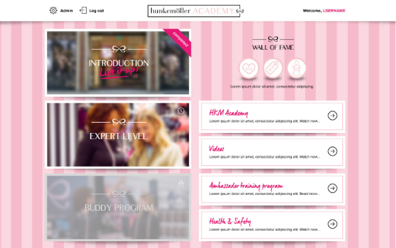
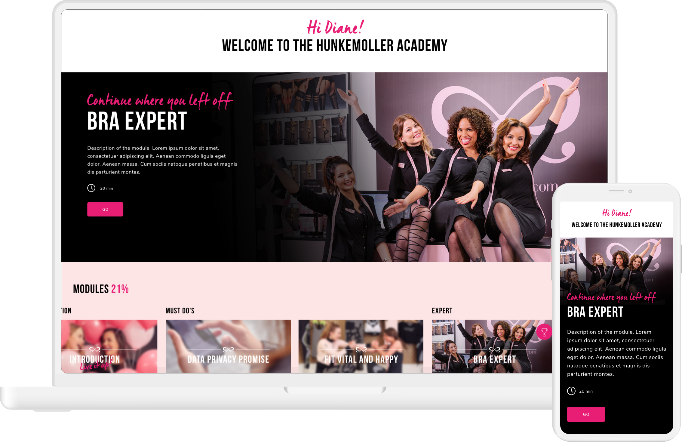
Home screen (old styling)
Module introduction (old styling)

Home screen (new styling)
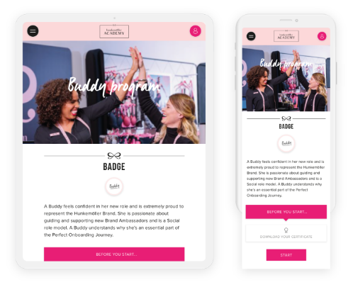
Module introduction (new styling)
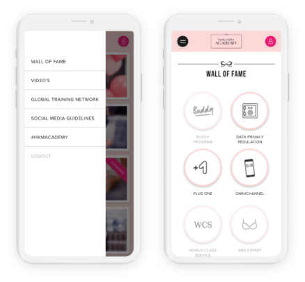
Navigation and wall of fame (new styling)
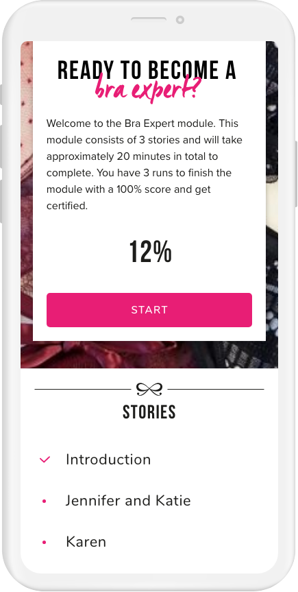
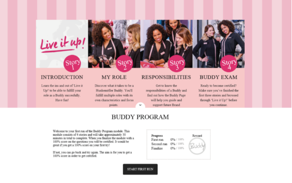
Module stories overview (new styling)
The old Hunkemöller platform contained instruction methods such as flash cards, hotspots and multiple choice questions that were designed only for tablet and desktop. I redesigned them for mobile and also designed a new ‘swipe cards’ interaction that did not exist yet.
After a successful content migration and restyling Hunkemöller decided to change their dashboard more radically. I was asked to do a dashboard redesign based on the Netflix concept: visually strong, easy to navigate and to filter, and upon revisiting the platform you can ‘continue where you left off’. Depending on their role - manager or new hire, store or HQ employee - anyone could immediately see which learning content was relevant to them.